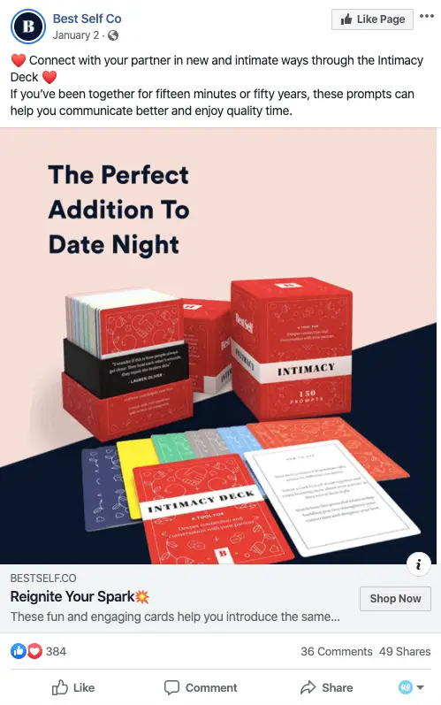
Examples of facebook ads
how to create facebook ads
If you’ve listened to English-language podcasts like Bill Simmons’, you’ve probably heard ads for the innovative underwear brand MeUndies. Their revolutionary underwear is super soft and stays looking like new thanks to new technologies.
This is an example of a good ad because of how the image stands out – how many times have you seen a woman riding a unicorn appear on your wall? Plus, the contrasting colors draw attention to the title. It’s a great image.
Sometimes, the simpler the better. Dollar Shave Club makes our list for its effective copy. Joking about other brands trying to create different products based on gender, Dollar Shave Club simply shows that their product is great regardless of who uses it.
Tip: The ad shows exactly what you’ll get when you buy the product. And it’s also honest with its customers about who can use its product, not trying to pigeonhole anyone and focusing on what makes its product the best.
advertisements in spanish
Using eye-catching colors as we see in the example above, which break with the dynamics of the TimeLine publications, increases the chances that the user will stop for a moment to find out what the ad is about and what it is offering.
This type of advertisement is very important for the brand image of the company, but it has the complexity that you have to know how to attract attention in a positive way so that the event is attractive for the user to attend it.
This type of strategy is highly recommended to be put into practice so that the user can hire the service or buy the product he was interested in the past with just one click.
Unlike the other ads, in this one you do not need to go through the ad manager to advertise it, but as a plus point you can put more text in the description and even leave a link in it.
To do this, an effective technique for the user to recognize us at the first time is to introduce the logo of our brand or company in the image of the ad because, in this way, it draws more attention to the user by allowing it to be larger than in the profile image. (You can see the example perfectly in the image above this text).
sales on facebook
In this example (screenshot taken from Swiped.co) you will see the ad in question and comments analyzing the ad in question. It is very worthwhile to do this kind of analysis of the ads to realize the formulas that are used to create them.
Video ads are often a big hit. As long as the video is well done, of course. More and more people prefer to watch a video rather than a photo. In any case, think that a video retains users much longer, so you get more visibility for the brand.
A targeted WhatsApp ad can be a photo ad, a video ad… the difference will be in the call-to-action button (it will have the WhatsApp icon) and in the behavior of the ad (WhatsApp will open when the button is clicked).
As I mentioned before, if you use an ad with a lead generation objective and link the form to your mailing list, you can reduce the steps for your potential customer to get his gift. In this case, with a lead type ad, the steps would be as follows:
advertising phrases to sell
This data is, to say the least, interesting. But how can you capitalize on these numbers for your business? How many of these millions of users can you effectively reach? Is it possible to be featured within this social network when there is so much competition to attract the attention of potential customers?
A value proposition communicates to the reader why they should click on your ad to learn more about your product. What differentiates your product or service from others? Why should the visitor click on your ad to view your website?
Having a beautiful and relevant ad is great, but without a call to action (CTA) your visitor might not know what to do next. Adding a CTA such as “Buy now and save X%” or “This offer will end soon” will create a sense of urgency in the visitor. Your CTA should make people want to click on the ad right away.
Tell your audience what you want from them: to sign up, to visit you, to buy, to take advantage of a discount? If you are clear on this, it will be easier for people to make the conversion you expect.
